
Jagex Branding
Working on the Jagex branding was a nice break from working on Runescape and its medieval fantasy theme. As a result I wanted to ensure we had something much cleaner with more of a modern feel. Initially we worked with an agency who conceived the new logo, and they had produced an interesting but slightly busy concept. The concept evolved around a grungy, urban textured background and parts of the logo poking in from the edges of the screen to leave a series of random shapes. This felt a bit haphazard.
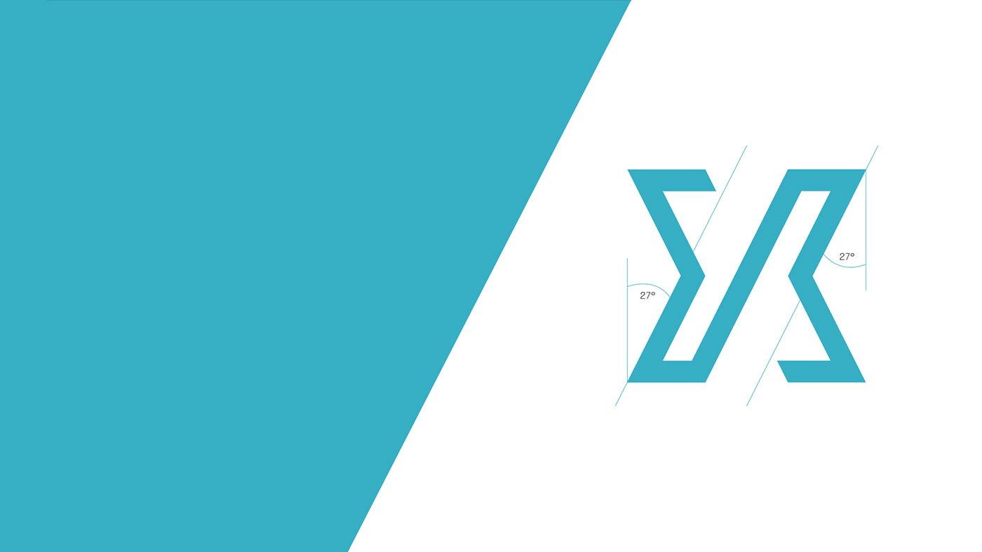
I wanted to build a much stronger foundation with a clearer rule set in place. Something that would be strong enough as a brand identifier, but flexible enough that we could have fun with it in future. After much experimenting I evolved the random shapes and broke it down to the simplest version of this. A simple slice. Not just a random slice though, one structured to match the logo. A 27 degree angle cut always rising from left to right to show positive progression. In some instance you can still imagine these lines being the logo, just very large on the canvas.


Colours
Having such a solid foundation meant that we didn't need to rely on a single brand colour. As and when needed we could change the colours and it would still very much feel like our brand. Future use of this would allow us to use different colours to represent different aspects of the business.


